
The New Home Screen and Planner: What Changed, and Why
In Scenic iOS version 4.43 and Android version 3.76 we changed the Home Screen and Planner layout. Let me start by saying this:
Nothing was removed. No functions were added, changed or removed in the updated Home Screen and Planner. Everything you used before is still there. It’s just reached in a slightly different way.
I know that’s not how it felt to everyone. A lot of emails landed in my inbox, and most of the emails said some version of the same thing: “where did my buttons go?”. So this post is the map, explaining how the old UI maps to the new UI. Below is how the new interface lines up with the one you knew, and at the end, why I changed it at all.
The minimize button
Start here, because it’s the quickest way to feel at home again.
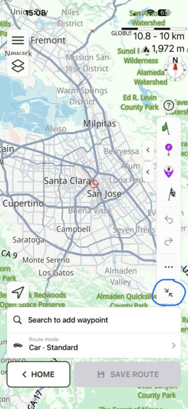
The minimize button collapses the planner panel down, giving the map back the space it had in the old layout.
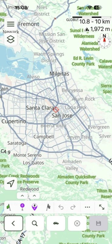
If the new screen feels crowded compared to what you’re used to, tap this first.
Adding vias and stops
This is where nearly all the confusion came from, so let’s be precise about it.
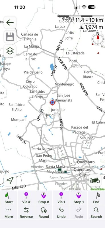
The old UI had four buttons:
- Via # and Stop # on the left. These added a via or stop between waypoints already on the map.
- Via ⟨nr⟩ and Stop ⟨nr⟩ on the right. These added a via or stop as the next one, i.e. last in the list.
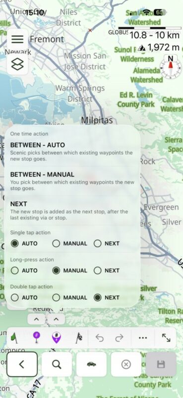
Note that this is the iOS 4.44 pop-up menu. iOS 4.43 and Android 3.76 don’t have the long press and double-tap feature. iOS 4.44 was already released and so these feature are already available to everyone on iOS. Android will follow very soon.
The new UI has two buttons. By default they behave like the two on the left of the old UI. If you were a right-hand-button planner, that’s why your route planner suddenly acted strange and added unexpected loops. And that’s the whole misunderstanding in one sentence.
All three behaviours are still there. They’re now gestures on the same two buttons:
| What you want | Old UI | New UI |
|---|---|---|
| Add between existing waypoints, placed automatically | left Via # / Stop # | single tap — AUTO |
| Place it yourself, exactly where you want it | long press the left buttons | long press — MANUAL |
| Add as the next one in the list | right Via ⟨nr⟩ / Stop ⟨nr⟩ | double tap — NEXT |
You’ll also see two small chevron buttons above the Via and Stop buttons. Tapping one opens a menu where you can set the mode explicitly and read a short description of each. That menu is there as a reminder. You don’t need to open it every time. Once the gestures are in your fingers, you’ll plan just as fast as you did before.
Why change it all?
If it ain’t broken, don’t fix it!
That’s what I thought about the planner for years. But “not broken” and “as good as it could be” aren’t the same thing, and the mail from riders new to Scenic kept circling the same three problems:
- The routing mode. People didn’t know which mode they were in, and often didn’t know what that vehicle icon was for at all.
- Four buttons for vias and stops. What’s the difference between them? And, again and again: “I had no idea a long press was even possible.”
- The “other” button with the strange icon (guidance to route). “No idea what this does.”
Hidden functionality is only a feature if you know it’s there. For a rider planning their first route in Scenic, three of the planner’s most useful behaviours were effectively invisible.
The new layout was built to fix that without taking anything away from people who already knew the shortcuts. The modes are now named and visible, so a new rider can find them; the gestures sit on top, so you can skip the menu entirely once you know what you’re doing. Every behaviour that existed still exists, it just announces itself now.
That part worked: those emails have largely stopped. What I underestimated was how much muscle memory a long-time user builds up around four buttons in fixed positions, and how disorienting it is to open the app one morning and find two. That’s on me, and it’s why this post exists.
Give it a week
If you plan the way you always have: tap for one thing, double tap for the other! The new buttons will stop feeling new surprisingly fast. Most riders who wrote to me in the first week haven’t written since, and a few have said the gestures are just as quick as the old layout once they got used to it.
If something still doesn’t map onto what you’re used to, tell me through the forum or email me through the help page. Your messages after the last update are a big part of why this article is here at all.


Dankjewel Guido, heel fijn de nieuwe mogelijkheden. En ook mooi dat er nu een uitleg te lezen is voor gebruikers zoals ik, die niet elke dag een nieuwe route plannen.
Perfect, zo laten – niks meer aan doen!
Hi Guido, I have just returned from a 16 day tour including France, Belgium, Germany, Czechia and Austria. I used Scenic for the routes and it was excellent, except for…road closures. We experienced these on many days in Germany, on one day we had no fewer than 5! Scenic shows the road as closed but did not offer any warning prior to the blocked road or suggest a detour to get us back on route. On a number of occasions I had to resort to google maps to get me to the next Scenic planned stop and then skip all the intervening missed waypoints on Scenic to get it back on track. Am I missing out on something?
Thanks for any advice you can offer. John & Pamela
https://scenic.app/forum/topic/avoid-known-road-closures/#postid-16272
Guido, I am still struggling with this program. I don’t want to be putting weight points every quarter mile. But if I hit my start point then tell it where I want to go. I want to set my own route. It just keeps taking me in these crazy loops. So if I try to put waypoints in between and change the route, the next thing I know it sent me on some crazy loop and back to the original route that it chose for me. How do I fix this to where I can move from my waypoint to my next waypoint and still get to the end? I don’t need it to second. Guess how I want to get there.