Routes list clarity
Quote from Maxodo on 05.11.2021, 18:13Sorry Guido, not too sure about this and as a lifetime subscriber rather sad about the changes forced on us. I guess it will take some time to get used to the changes. But immediately I have an issue with the list of routes (I have 70).
Having the tiny map on a phone is distracting and takes long time to load. In addition all the extra info is not really helpful and distracting.
The actual route name disappears into all the other info and I can only see two routes at a time without having to keep scrolling in a little window at the bottom. In addition you can only see the first two words or so of a longer description.
Can’t we have a simple text list as before which is so much easier to scroll through and find favourites?
Sorry Guido, not too sure about this and as a lifetime subscriber rather sad about the changes forced on us. I guess it will take some time to get used to the changes. But immediately I have an issue with the list of routes (I have 70).
Having the tiny map on a phone is distracting and takes long time to load. In addition all the extra info is not really helpful and distracting.
The actual route name disappears into all the other info and I can only see two routes at a time without having to keep scrolling in a little window at the bottom. In addition you can only see the first two words or so of a longer description.
Can’t we have a simple text list as before which is so much easier to scroll through and find favourites?
Quote from Maxodo on 05.11.2021, 18:17To illustrate the issue, very difficult and time consuming now to find a route when all I can see is a tiny window and two half titles, it’s really frustrating. And on a regular iPhone it is much smaller than this!
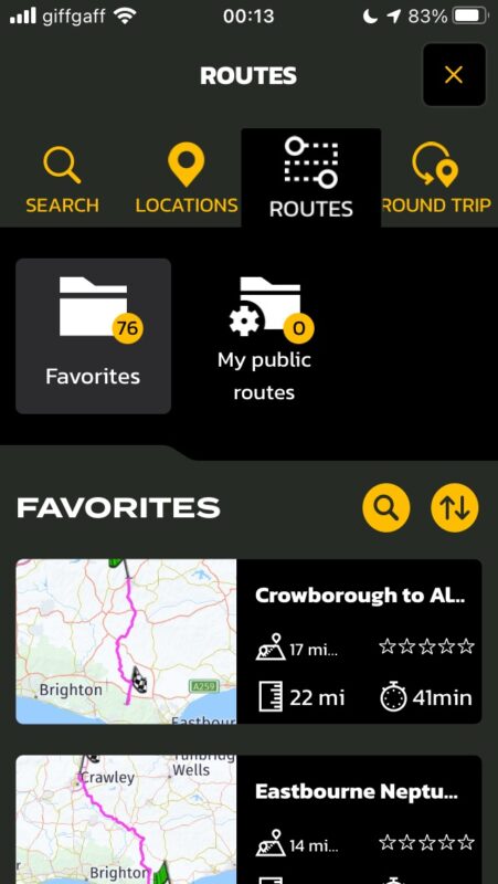
To illustrate the issue, very difficult and time consuming now to find a route when all I can see is a tiny window and two half titles, it’s really frustrating. And on a regular iPhone it is much smaller than this!
Quote from Guido on 05.11.2021, 18:21I understand your point. The loading only talk long because the first time scenic needs to generate the map thumbnails.
The thumbnails were a highly requested feature of Scenic 2. You won’t believe how many complaint I got when removing them from Scenic 1 going to scenic 2. Now I’ve added them again.
Resulting from the thumbnails that take up space there is less space for other things.
I might be adding a ‘list only’ view in the future, but for now, I’m afraid this is it. It also depends a lot on the device you have. Bigger screens will display more routes on screen obviously.
I understand your point. The loading only talk long because the first time scenic needs to generate the map thumbnails.
The thumbnails were a highly requested feature of Scenic 2. You won’t believe how many complaint I got when removing them from Scenic 1 going to scenic 2. Now I’ve added them again.
Resulting from the thumbnails that take up space there is less space for other things.
I might be adding a ‘list only’ view in the future, but for now, I’m afraid this is it. It also depends a lot on the device you have. Bigger screens will display more routes on screen obviously.
Quote from Maxodo on 05.11.2021, 18:24Sorry Guido, I know you will have put a huge amount of work into this but some of the changes are not good and a step back.
You can see it is crazy to only see two at a time and we cannot even see the whole title?? We cannot blame this on the users chosen phone size (for me 6s), at least the list should use the whole screen not a tiny portion at the bottom?
Also on the iPad that is useful for planning (obviously a phone for navigation) and naturally held in landscape mode the list of routes is in two columns but in alphabetical order it goes left, right, left, right etc and not in one column A-Z down the left and continuing on the right. Again this make it very difficult as the eyes have to go left/right/left/right/left/right…which is not natural and it would be much easier to scroll quickly with the alternative I mention.
Sorry Guido, I know you will have put a huge amount of work into this but some of the changes are not good and a step back.
You can see it is crazy to only see two at a time and we cannot even see the whole title?? We cannot blame this on the users chosen phone size (for me 6s), at least the list should use the whole screen not a tiny portion at the bottom?
Also on the iPad that is useful for planning (obviously a phone for navigation) and naturally held in landscape mode the list of routes is in two columns but in alphabetical order it goes left, right, left, right etc and not in one column A-Z down the left and continuing on the right. Again this make it very difficult as the eyes have to go left/right/left/right/left/right…which is not natural and it would be much easier to scroll quickly with the alternative I mention.
Quote from Guido on 05.11.2021, 19:06I will add it to the list to also have a list view without thumbnails and expand the title.
But please, give it some time to get used to it.
I know it’s a big change but in the end… this will be the way forward. These changes have not been done without reason. They are based on 3 years of user feedback.
For example… your screenshot is when accessing routes through the map search function. When accessing routes through the side menu there is more space available. Also there is a search function ti find the route you want faster.
I know… it’s not the same as seeing a quick list of 7 or 8 routes, but the thumbnail does add value for a lot of people. People who are more visually oriented can now see in one quick glance at the thumbnail what route they are looking at.
Having said that… I do recognize your point. And also knowing that apple will probably keep the smaller devices around much longer (iPhone SE 2nd gen, iPhone 13miji, etc. ) I will look into an alternative ‘mode’ for those smaller screens.
I will add it to the list to also have a list view without thumbnails and expand the title.
But please, give it some time to get used to it.
I know it’s a big change but in the end… this will be the way forward. These changes have not been done without reason. They are based on 3 years of user feedback.
For example… your screenshot is when accessing routes through the map search function. When accessing routes through the side menu there is more space available. Also there is a search function ti find the route you want faster.
I know… it’s not the same as seeing a quick list of 7 or 8 routes, but the thumbnail does add value for a lot of people. People who are more visually oriented can now see in one quick glance at the thumbnail what route they are looking at.
Having said that… I do recognize your point. And also knowing that apple will probably keep the smaller devices around much longer (iPhone SE 2nd gen, iPhone 13miji, etc. ) I will look into an alternative ‘mode’ for those smaller screens.
Quote from Maxodo on 06.11.2021, 03:23Thank you Guido, your reply is appreciated. I have been very passionate about Scenic on here in the past as it has been an incredibly helpful tool to motorcycling so I hope you do not mind me pointing out these issues.
Luckily I do not have automatic downloads on my 6S Plus which I use for nav - of course I know I will have to update one day! But on there I still have Scenic 2. Can I continue to use 3 on the iPad for route planning and 2 on the phone?
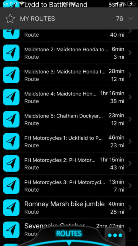
You can see how easy the list of routes is to find one on the screenshot from Secnic to on my Plus below. On Scenic 3 on a 6S it is like looking for a word in a dictionary with only 2 or 3 words to a page!
Also will you look at the iPad columns issue above, not sure if I explained it well but basically it would be a lot easier and more intuitive to have A-S say on the left column then scroll up to A-Z on the right column?
Thank you Guido, your reply is appreciated. I have been very passionate about Scenic on here in the past as it has been an incredibly helpful tool to motorcycling so I hope you do not mind me pointing out these issues.
Luckily I do not have automatic downloads on my 6S Plus which I use for nav - of course I know I will have to update one day! But on there I still have Scenic 2. Can I continue to use 3 on the iPad for route planning and 2 on the phone?
You can see how easy the list of routes is to find one on the screenshot from Secnic to on my Plus below. On Scenic 3 on a 6S it is like looking for a word in a dictionary with only 2 or 3 words to a page!
Also will you look at the iPad columns issue above, not sure if I explained it well but basically it would be a lot easier and more intuitive to have A-S say on the left column then scroll up to A-Z on the right column?
Quote from Maxodo on 06.11.2021, 03:47Quote from Guido on 05.11.2021, 19:06For example… your screenshot is when accessing routes through the map search function. When accessing routes through the side menu there is more space available. Also there is a search function ti find the route you want faster.
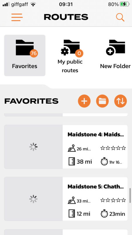
Guido, I have looked at the routes side menu and it is the same (see below) only two shown at a time.
Also now the menu is at top left - it is furthest away from most people's thumbs whereas on the bottom it was much easier to reach and use...
Quote from Guido on 05.11.2021, 19:06For example… your screenshot is when accessing routes through the map search function. When accessing routes through the side menu there is more space available. Also there is a search function ti find the route you want faster.
Guido, I have looked at the routes side menu and it is the same (see below) only two shown at a time.
Also now the menu is at top left - it is furthest away from most people's thumbs whereas on the bottom it was much easier to reach and use...
Quote from Guido on 06.11.2021, 06:25I can’t change the sorting left-right issue. This is because it’s built in in iOS. It also makes sense if you think about it. If it would be top-bottom first you would have to scroll down and the back up again a few times. While now, with left-right first, you only scroll down once.
looking at your route naming… perhaps creating some folders could also be helpful ? in locating your routes faster E.g. a folder named ‘Maidstone’ and a folder named ‘PH Motorcycles’
In any case. Your point is clear. I will give it some more thought and come up with a no-thumbnail mode as a configuration option. That’s going to take some time though so please bare with me.
I can’t change the sorting left-right issue. This is because it’s built in in iOS. It also makes sense if you think about it. If it would be top-bottom first you would have to scroll down and the back up again a few times. While now, with left-right first, you only scroll down once.
looking at your route naming… perhaps creating some folders could also be helpful ? in locating your routes faster E.g. a folder named ‘Maidstone’ and a folder named ‘PH Motorcycles’
In any case. Your point is clear. I will give it some more thought and come up with a no-thumbnail mode as a configuration option. That’s going to take some time though so please bare with me.
Quote from Guido on 06.11.2021, 06:39Can I continue to use 3 on the iPad for route planning and 2 on the phone?
yes, but be aware, scenic 3 has a different routing algorithm. Here is more info on this: https://scenic.app/help/scenic-3-info/
Can I continue to use 3 on the iPad for route planning and 2 on the phone?
yes, but be aware, scenic 3 has a different routing algorithm. Here is more info on this: https://scenic.app/help/scenic-3-info/
Quote from Maxodo on 06.11.2021, 08:34Thank you as always Guido.
It cannot be easy trying to please everyone! ; -)
Thank you as always Guido.
It cannot be easy trying to please everyone! ; -)
Quote from Guido on 06.11.2021, 10:34Haha. Impossible really 🙂
Haha. Impossible really 🙂


