
new svenic UI

Quote from petereis on 09.08.2026, 06:07Please give us an option to use the old scenic Home Screen and Planner UI.
Please give us an option to use the old scenic Home Screen and Planner UI.


Quote from Guido on 09.08.2026, 07:01Yes. Version 3.43 changed the UI in the Home Screen and the planner a bit. Rest of the UI is still the same.
Give it a bit of time. You’ll get used to it. Nothing functionally changed. It’s all still there, and almost in the same place as it was.
My reason for the change is feedback I got from new users. The biggest new user confusions were these:
- Not knowing what routing mode that they were on, and not even knowing what that vehicle icon was doing.
- 4 buttons to add vias/stops. What’s the difference? And “I didn’t know a long press was possible”.
- The “guidance to route” button. “No idea what this does”.I think I’ve addressed all of this with the new UI (which is actually very similar to the old Scenic 3 UI), while maintaining all functionality. Everything is discoverable now (no more hidden long presses), there are clear descriptions on the pop-up menus and in the big buttons (when not minimized).
Having said that, I’m of course always open for feedback, but please make it concrete, with an example if possible. Something that’s really more difficult, really less intuitive, really takes more time now compared to before.
Change can be good 😊
UPDATE AUG 13:
The most difficulty existing users have is the reduction of via/stop buttons from 2 to 4. That’s why the little chevron buttons next to/above tha via and stop buttons are there now. Tap that and a popup menu appears where you can choose a one-time action by tapping one of the 3 top rows and change the default action of the buttons (it comes complete with descriptions so you know what they will do). I’ve already had feedback that people miss the long press so I’m going to bring that back too in the next version.
Yes. Version 3.43 changed the UI in the Home Screen and the planner a bit. Rest of the UI is still the same.
Give it a bit of time. You’ll get used to it. Nothing functionally changed. It’s all still there, and almost in the same place as it was.
My reason for the change is feedback I got from new users. The biggest new user confusions were these:
- Not knowing what routing mode that they were on, and not even knowing what that vehicle icon was doing.
- 4 buttons to add vias/stops. What’s the difference? And “I didn’t know a long press was possible”.
- The “guidance to route” button. “No idea what this does”.
I think I’ve addressed all of this with the new UI (which is actually very similar to the old Scenic 3 UI), while maintaining all functionality. Everything is discoverable now (no more hidden long presses), there are clear descriptions on the pop-up menus and in the big buttons (when not minimized).
Having said that, I’m of course always open for feedback, but please make it concrete, with an example if possible. Something that’s really more difficult, really less intuitive, really takes more time now compared to before.
Change can be good 😊
UPDATE AUG 13:
Quote from petereis on 09.08.2026, 23:40Thanks for the reply, Guido.
I see your point, but thats exactly it: from a power users perspective the 4 buttons to add vias/stops and the long press made it quick and clear. Making it foolproof is slower.
Thanks for the reply, Guido.
I see your point, but thats exactly it: from a power users perspective the 4 buttons to add vias/stops and the long press made it quick and clear. Making it foolproof is slower.

Quote from Guido on 11.08.2026, 08:30I’m bringing back the long press 😊
I’m bringing back the long press 😊
Quote from petereis on 11.08.2026, 09:31Quote from Guido on 11.08.2026, 08:30I’m bringing back the long press
Thank you very much! If every app had support like your’s from the dev teams, people wouldn’t leave platforms at all. Happy to pay for the next 12 mounths soon.

Quote from Guido on 11.08.2026, 08:30I’m bringing back the long press
Thank you very much! If every app had support like your’s from the dev teams, people wouldn’t leave platforms at all. Happy to pay for the next 12 mounths soon.

Quote from LarsG on 16.08.2026, 01:46
i would like to suggest that the bottom section of the new UI is more compressed. Home to be moved to the Hamburger Navigation. Same with save. Search, routing Mode and navigation to Route Start in on popular Butten just over the expand button on the right. It’s just using to much space, which makes planning no longer fun
i would like to suggest that the bottom section of the new UI is more compressed. Home to be moved to the Hamburger Navigation. Same with save. Search, routing Mode and navigation to Route Start in on popular Butten just over the expand button on the right. It’s just using to much space, which makes planning no longer fun

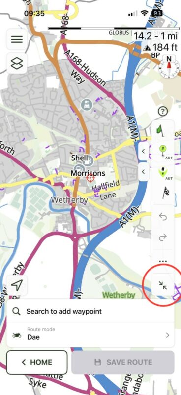
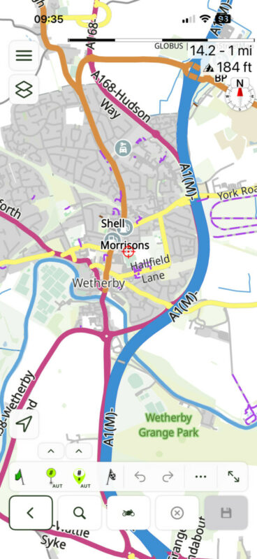
Quote from LarsG on 16.08.2026, 07:07Quote from Dae on 16.08.2026, 02:37It’s much better if you use the minimised view
Ah! You are so right Dae . I feel stupid now because I thought the button wouldnonöy minimize the right side button :-).
thank you.
Quote from Dae on 16.08.2026, 02:37It’s much better if you use the minimised view
Ah! You are so right Dae . I feel stupid now because I thought the button wouldnonöy minimize the right side button :-).
thank you.
Quote from Papa smurf1 on 16.08.2026, 11:46How can you turn off the function of round trip while planning as I stated before new version this week loops after placing just a few waypoints or vías back to start and/ or move start point to an Unwanted spot. Have you actulaly tried placing a few vías kike 15 to 18 without it looping back. Sorry for staying on this topic but until I figure it out ur app is useless.
How can you turn off the function of round trip while planning as I stated before new version this week loops after placing just a few waypoints or vías back to start and/ or move start point to an Unwanted spot. Have you actulaly tried placing a few vías kike 15 to 18 without it looping back. Sorry for staying on this topic but until I figure it out ur app is useless.
Quote from Dae on 16.08.2026, 12:07I’ve planned 15 days of routes over 2,500 miles and not encountered any issues. Yes, it looks different, but it functions as it always has done.
I’ve planned 15 days of routes over 2,500 miles and not encountered any issues. Yes, it looks different, but it functions as it always has done.
Quote from Guido on 16.08.2026, 14:55Quote from Papa smurf1 on 16.08.2026, 11:46How can you turn off the function of round trip while planning as I stated before new version this week loops after placing just a few waypoints or vías back to start and/ or move start point to an Unwanted spot. Have you actulaly tried placing a few vías kike 15 to 18 without it looping back. Sorry for staying on this topic but until I figure it out ur app is useless.
Round trip planning is not the issue. I think you are using auto-placement of via/stop. Try manual or end placement (little chevron buttons beside the via/stop button)
Quote from Papa smurf1 on 16.08.2026, 11:46How can you turn off the function of round trip while planning as I stated before new version this week loops after placing just a few waypoints or vías back to start and/ or move start point to an Unwanted spot. Have you actulaly tried placing a few vías kike 15 to 18 without it looping back. Sorry for staying on this topic but until I figure it out ur app is useless.
Round trip planning is not the issue. I think you are using auto-placement of via/stop. Try manual or end placement (little chevron buttons beside the via/stop button)
Quote from Leila B on 19.08.2026, 05:06Can you go back to the old version of the planning mode on IPhone? I can hardly see what I’m doing due to all the extra buttons that are visible on the screen. 🫣
Can you go back to the old version of the planning mode on IPhone? I can hardly see what I’m doing due to all the extra buttons that are visible on the screen. 🫣
Quote from Dae on 19.08.2026, 05:32No, but if you look at post 11 in this thread and use the minimised version it’s practically the same as before.
https://scenic.app/forum/topic/new-svenic-ui/#postid-16508
No, but if you look at post 11 in this thread and use the minimised version it’s practically the same as before.
Quote from johansw on 19.08.2026, 06:37And the long-press function for placing vias and stops might be brought back :-))
And the long-press function for placing vias and stops might be brought back :-))
Quote from MLH on 20.08.2026, 09:11Quote from petereis on 09.08.2026, 06:07Please give us an option to use the old scenic Home Screen and Planner
I quite like it. It’s easy to use & appears to have no more foibles than the previous UI. Still, each to their own.
Quote from petereis on 09.08.2026, 06:07Please give us an option to use the old scenic Home Screen and Planner
I quite like it. It’s easy to use & appears to have no more foibles than the previous UI. Still, each to their own.
Quote from petereis on 10.09.2026, 14:23Quote from Guido on 11.08.2026, 08:30I’m bringing back the long press
Guido, this press/longpress/doublepress combination is an excellent solution. Keep up the good work!
Quote from Guido on 11.08.2026, 08:30I’m bringing back the long press
Guido, this press/longpress/doublepress combination is an excellent solution. Keep up the good work!


