Colours Icons for Road Block/Skip Vias etc
Quote from Ian744 on 23.06.2023, 05:10Hi Guido,
I have just returned from a 3000 mile motorbike road trip in the USA using Scenic and I have a request.
I am in my 60s and find it difficult to read the smaller text on Scenic when navigating, especially when a detour or similar occurs. Could we please have different coloured icons for the monochrome navigation menu. This would not only make it easier to see the choices but also safer as eyes off the road time would be shortened. (My old TomTom Urban Rider was great for this).
Otherwise, Scenic was a perfect companion for the trip. Great for planning & replanning and sharing the route with my biker buddy.
Regards
Ian
Hi Guido,
I have just returned from a 3000 mile motorbike road trip in the USA using Scenic and I have a request.
I am in my 60s and find it difficult to read the smaller text on Scenic when navigating, especially when a detour or similar occurs. Could we please have different coloured icons for the monochrome navigation menu. This would not only make it easier to see the choices but also safer as eyes off the road time would be shortened. (My old TomTom Urban Rider was great for this).
Otherwise, Scenic was a perfect companion for the trip. Great for planning & replanning and sharing the route with my biker buddy.
Regards
Ian
Quote from Guido on 23.06.2023, 05:26Hi Ian,
In settings > colors & style, you can change the ‘overall tint color’. This will change the color of many elements in the user interface, including the buttons in the navigation menu. Is that perhaps what you are looking for?
Cheers,
Guido
Hi Ian,
In settings > colors & style, you can change the ‘overall tint color’. This will change the color of many elements in the user interface, including the buttons in the navigation menu. Is that perhaps what you are looking for?
Cheers,
Guido
Quote from Ian744 on 23.06.2023, 09:55Hi Guido,
Thanks for your prompt reply, but changing the tint colour still results in a monochrome menu and I have to remember the position of the required menu item in the grid. This is a view of the customisable TomTom quick access menu and is more the kind of thing I had in mind.
Regards
Ian
Hi Guido,
Thanks for your prompt reply, but changing the tint colour still results in a monochrome menu and I have to remember the position of the required menu item in the grid. This is a view of the customisable TomTom quick access menu and is more the kind of thing I had in mind.
Regards
Ian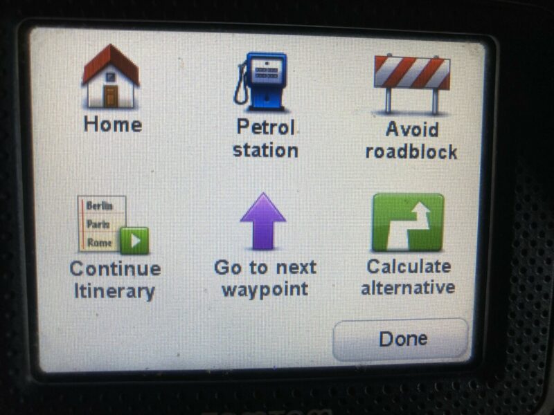
Quote from Guido on 23.06.2023, 10:35Ah. I see what you mean. Ill see what i can do. It’s always a delicate balance between functionality and looking clean, organized and not too ‘busy’. Too much color can also be distracting for some. Have to satisfy the preference of majority of users. I’m redesigning the menu a bit in the big update I’m working on. Will see if I can find a better balance.
Ah. I see what you mean. Ill see what i can do. It’s always a delicate balance between functionality and looking clean, organized and not too ‘busy’. Too much color can also be distracting for some. Have to satisfy the preference of majority of users. I’m redesigning the menu a bit in the big update I’m working on. Will see if I can find a better balance.


